< back
Schedule a Payment
The Issue:
At Say Insurance, every customer is on an autopay schedule.
Sometimes, customers want to pay on a different date, but our system doesn’t allow that.
Schedule a payment would let customers manually set up when they want their next payment to occur.
Our limitation was that scheduled payments cannot delay autopays, so my job was to design an easy-to-use payment process that doesn’t leave customers confused on their upcoming payments.

3 Use Cases:
-
paying the full amount, before the next autopay date
-
paying a partial amount, before the next autopay date
-
paying any amount, after the next autopay date
It was important to develop dynamic copy that could easily communicate to the customer how their choices would reflect their upcoming payments.

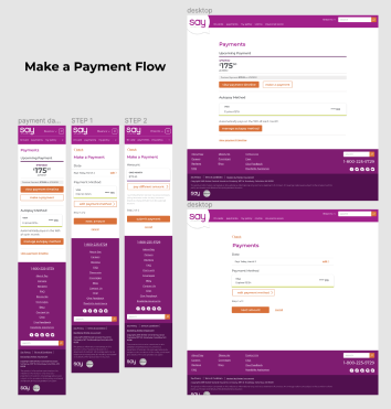
Wireframing
The first round of wireframes reflected the 3 use cases.
I like to start designing mobile first so that I am intentional with any space limitations I have.


My usability test taught me that it would be more straightforward to let the user select a date from one screen, rather than a different screen for each use case.
I landed on a dropdown that clearly indicated “Today” and the user’s next autopay date. This let me implement dynamic alert messages that would appear after the user’s date selection.
The copy gives quick information on how their next payments will function. This way, the user can easily change their mind before they’re already at the final payment screen.


After making those changes, I created high fidelity prototypes of the entire payment process. This led to a third usability test that was much more successful.
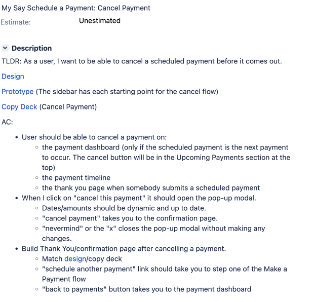
After designing the initial flow, I had to consider how a user could cancel a scheduled payment.
I added a link to our payment timeline & user dashboard. This opens a confirmation modal to avoid any accidental cancellations. There is also a cancellation link on the initial “Thank You” page, in case a user changes their mind immediately after finishing the flow.


My next step was to identify any places where this new feature would impact existing content on our site. I created high fidelity prototypes for any changes, so that our developers would have a visual to accompany any stories I wrote for them.
Story Writing:
With high fidelity prototypes, I was ready to write stories for my developers. This is written documentation that accompanies my designs to make it as easy for the developers to code as possible. I explain as many interactions, error messages, dynamic pieces, etc. as I can. This helps there to be less bugs when I UX-review the coded product.
This new feature was so large that I wrote 8 individual stories to start with. We usually adjust stories as a team once we have a good idea of the difficulty & limitations.


Unfortunately, this feature was never fully implemented because the Say Insurance brand was discontinued by its parent company.
However, getting through every step of the design process was priceless practice & insight for me, and I'm proud of where the feature ended up!