Email Revamp
When the email manager for Say Insurance left the company, our UX team saw an opportunity to streamline the user experience of our email messaging. We approached the marketing team with this idea and began a collaborative project to revamp all of Say Insurance’s emails.

When the email manager for Say Insurance left the company, our UX team saw an opportunity to streamline the user experience of our email messaging. We approached the marketing team with this idea and began a collaborative project to revamp all of Say Insurance’s emails.
When the email manager for Say Insurance left the company, our UX team saw an opportunity to streamline the user experience of our email messaging. We approached the marketing team with this idea and began a collaborative project to revamp all of Say Insurance’s emails.
The first step was an audit of the current situation. Since our UX team was approaching marketing, I created a presentation to justify why UX resources should be allocated to Say's email process.
I jumped headfirst into our previous marketing tool, Marketo, sorting through hundreds of files to find the emails that we were currently sending out. I created a spreedsheet to track
- each email
- what broader category they fall into (e.g. Policy, Payment)
- inconsistencies between emails
- accessibility issues


Our presentation was convincing, so we created a system to approve redesigned emails:
1. Myself and another UXer would rewrite and redesign each email
2. We would have weekly meetings with the marketing team to present, explain our design decisions, and note any further changes that needed to be made before they were ready.
3. Emails were either brought back to step one, or we moved forward by building them in new email tool, Marketing Cloud.
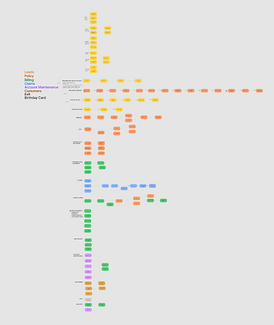
I created an email map next to let us see each category’s email flows. From here, we began deciding which emails to keep & rewrite, what needed redesigning, and what we could remove.
I designed a modernized header and footer for every email communication. I paid special attention to the colors we used.
Our past header was all orange, which is the color we use on our website to specify clickable text. I opted for magenta, with a car icon to immediately remind our customers that Say is their auto insurance. I also worked with our legal team on the footer to cut out unnecessary information without violating any email communication legal standards.

Next, we began rewriting and redesigning.
Some flows required more design emphasis, while other flows took ample Teams calls with other departments to understand the information enough for us to simplify it for customers.
Before UX

After UX

This is an early email in our Welcome flow for new policyholders.
Some changes I made:
- using color intentionally to improve accessibility and consistency with our website
- making links more understandable for screen readers
- making the email easier to read (using left alignment for body text, subheadings, and shortening/rewriting copy to highlight the most important ideas.
To help people who weren't on the project understand our changes, I created an interactive Figma prototype with every email.
We named it the Email Map.


After redesigning the emails, our last step was to create them within the new tool, Marketo. With the help of some code-savvy developers, we successfully moved Say's email communications to the new tool before our deadline.
Although this project differs from the typical UX endeavor, it taught me a lot about how to prioritize the user in every instance and flow, rather than just through web design. It also allowed me to practice streamlining user touchpoints to integrate with the website in the most useful and practical way for every customer.